DevLog 18: Retro Style and Symbolism in Game Art
Leene here this time talking a bit more about the visuals of Death and Taxes :)
Firstly I want to say how excited I am for the release! We are almost there, only one and a half months to go!!!!!!! AAAAAAAAAA!!!
Ok got that out of the way...
Now to the topic of visual design for the game world:
RETRO STYLE
I think that there is much to learn from the art history and I love games that take something from the past trends and make it new. So this is why I wanted to do something similar.
Games that employ a retro style, such as the Fallout or Bioshock series, look really cool to me because they use already worked out art styles and mix it up with new stylistic rules to make something completely new and fresh. (I also talked about it in a previous DevLog here!)
There are three main ways to choose a visual style:
- Inventing a new visual style for your game (a really experimental and hard way, hit or miss. One can argue that inventing something new is impossible, everything in this world is a remix).
- Using a style from another games (usually this is used but won’t make anything interesting, some people like getting what they are used to).
- Mixing up old styles that are not from the video game world originally. These techniques can be mixed as well and it is usually the way it is done.
Some developers do this automatically without thinking about if longer and stumble on something good but I really think it is good to think about this topic thoroughly and increase your chances to make something that stands out and at least feels new.
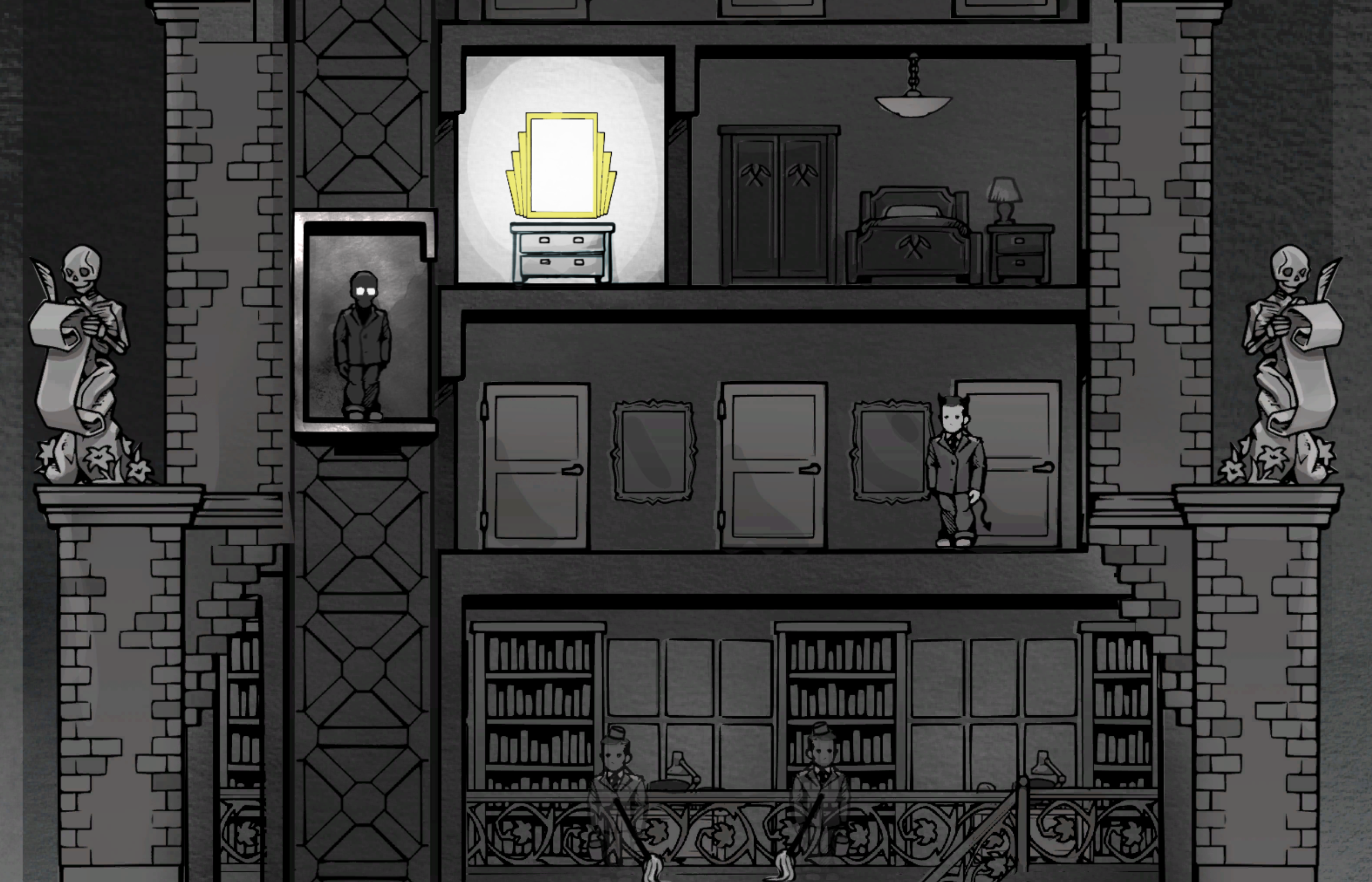
Death and Taxes is a melting pot of different styles, the main one being Art Deco (yes, like Bioshock). There are elements from the present time but also from ancient mythology - especially Egyptian and Celtic. We also incorporate elements from the 50s comic book style. Add a sprinkle of Mexican Día de Muertos to the mix and you get Death and Taxes!
To maintain a coherent style, it's really useful to choose what style will be the main one and not immediately mix everything. Having a specific style also makes teamwork with artists or musical composers easier. They could just look up a lot references on the set style, which makes the visual design document a bit shorter too.
You can also mix up some styles that don't naturally fit, if you think through it. One of the most crazy and stupid game jam games I made involved medieval soldiers in the 80 Disco and Vaporwave style. Not saying it is a good game, it was just fun to make and I like how crazy it looks. Take a look at it here: https://ldjam.com/events/ludum-dare/40/$58065
Symbolism and Mythology
As I wrote before Death and Taxes is a melting pot of different styles, and I'll explain briefly how that works for us.
The main style we went for is Art Deco (YES, BIOSHOCK >_>)
- All the interior design of the main building is in the style, including most of the items the player can find.
- The main font in the game is a retro typewriter font.
- There are golden and intricate ornaments everywhere.
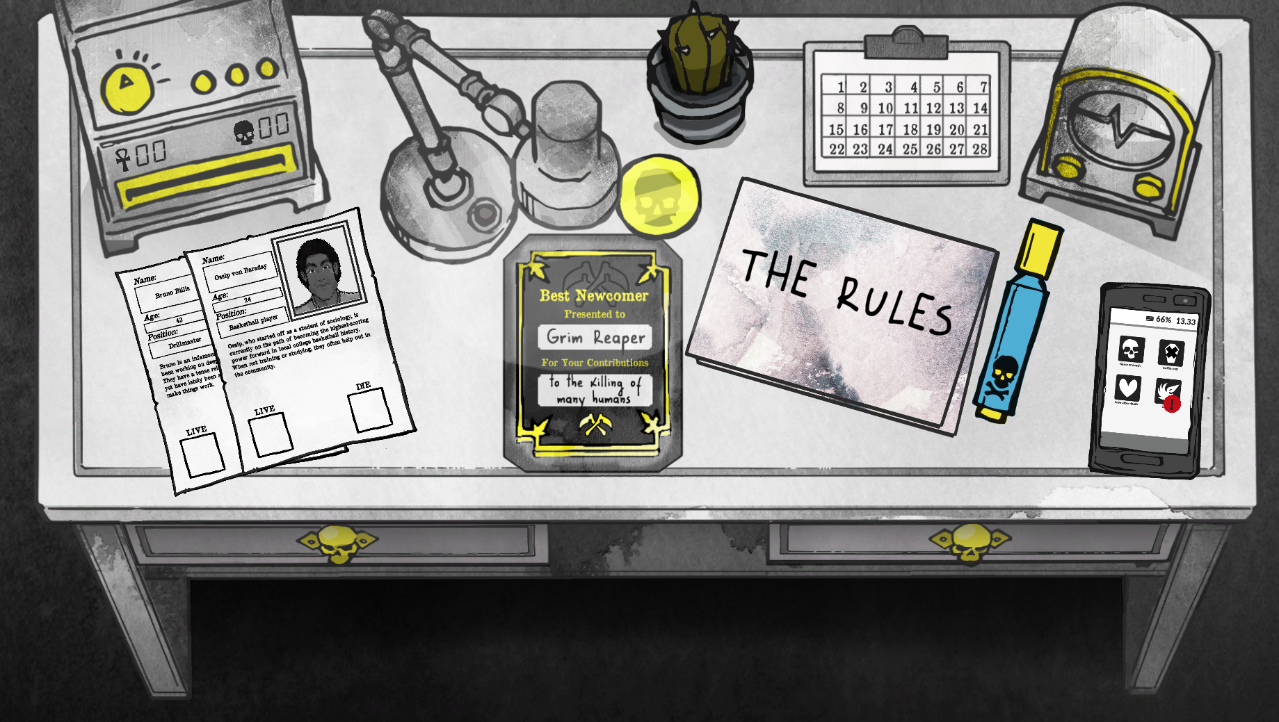
There are some symbols in the game that are similar in almost all of the cultures
- Skulls -> Death (d'uh).
- Flowers for funerals and death - White lilies in the wallpaper design.
- We might add some coffins to the menu design too.
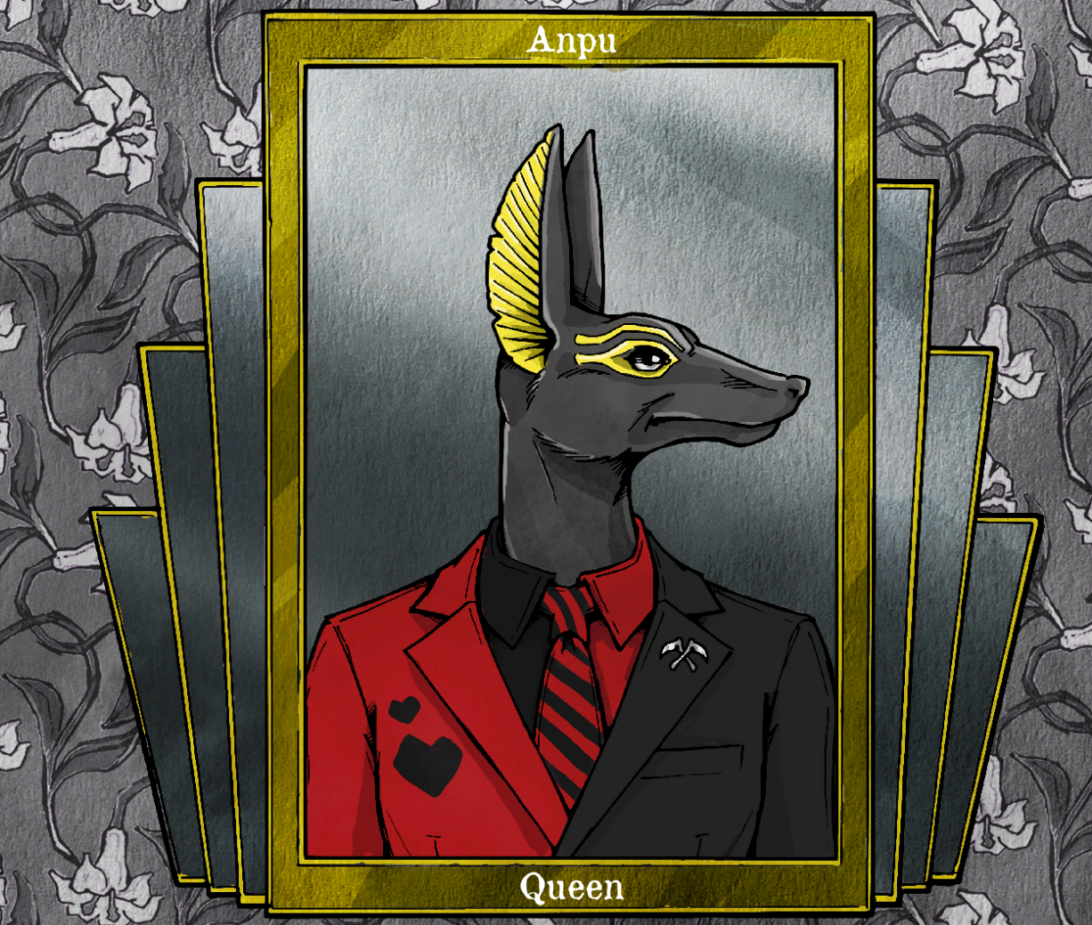
There are elements from the present time but also from ancient mythology - especially Egyptian and Celtic.
- The Raven and Morrigan from Irish mythology on the world's currency (we also have Crow/Raven cawks as sound effects).
- The Ankh symbolizes Life.
- You can choose to look like Anubis.
- The cat has an Egyptian collar.
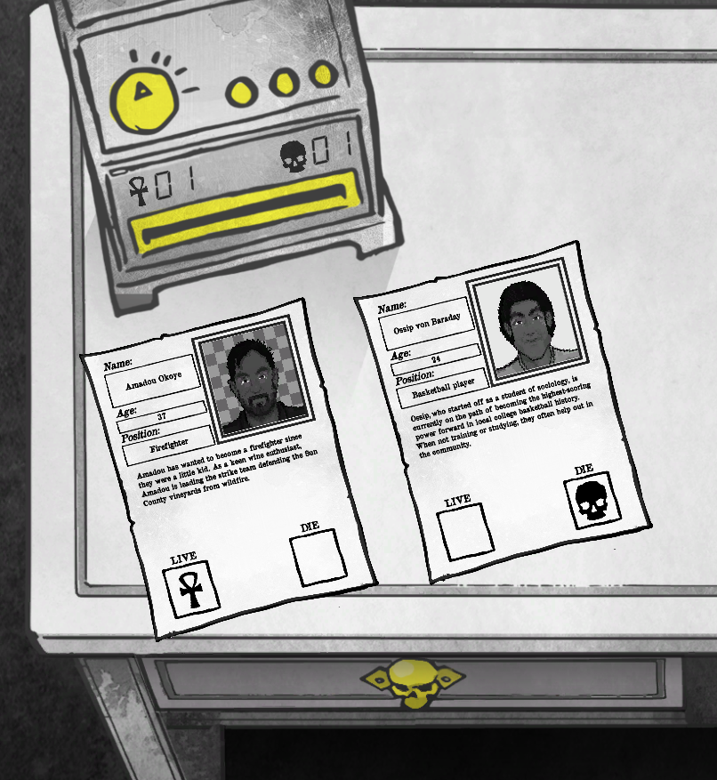
There are also some elements in Death and Taxes from the 50s comic books style.
- The black-and-white with some popping colors. From the times when it was expensive to print many colors.
- Speech bubbles and comic book cutscenes.
- There are several in-game references to Batman characters. (I won’t spoil them ;) )

With the aforementioned Mexican Día de Muertos, with its colors and flower-skulls, you get Death and Taxes! Of course, there are some other themed things in the game as well, such as the office paperwork or even pirate stuff in one scene.
We wanted to keep away from the usual religious symbolism of death in modern society, for example, christianity, with crosses or heaven/hell. I think that sometimes, it is a good idea to break free of some of the usual symbolism that is overused in mainstream media and take a look at how different cultures visualize different elements.
So that's it for this time! Back to working on the game! We are going to release the gameplay trailer too in the next few days. :)
Much love!
Death and Taxes
Get Death and Taxes
Death and Taxes
You are the Grim Reaper on an office job. Save the world.. or condemn it to damnation?
| Status | Released |
| Author | Placeholder Gameworks |
| Genre | Simulation, Visual Novel |
| Tags | 2D, Atmospheric, Dark Humor, death, Meaningful Choices, Narrative, Story Rich, watercolor, weird |
| Languages | English |
| Accessibility | Color-blind friendly |
More posts
- Hats & SpanishJul 30, 2024
- Death and Taxes: Now in More Languages than Before <_<Mar 17, 2023
- Released a free Death and Taxes Coloring Book! (download here)Mar 18, 2022
- Death and Taxes @ IWOCon 2021!Mar 28, 2021
- Death and Taxes Anniversary FATE BODY PILLOW Raffle!Feb 16, 2021
- First Anniversary and Brazilian Portugese localization release!Feb 15, 2021
- Death and Taxes - Best Estonian Game of 2020!Jan 18, 2021
- Halloween Update Update and Winter Sale!Dec 23, 2020
- Death and Taxes in Top 100 for IndieDB Indie of the Year!Dec 11, 2020
- WHAT IS HAPPENINGNov 26, 2020
Leave a comment
Log in with itch.io to leave a comment.