Death and Taxes
DevLog 11: The Evolution of an Indie Game Art
Hi!
Leene here for the second blog post! ^^
This time I wanted to show you how the art of Death and Taxes has evolved and why I made some of the art direction decisions. Maybe some developers find some useful tips here too. First, we have to go back in time to where it all started.
- THE IDEA PHASE
The project started a while ago (I don’t even know when anymore, feels like years, WHAT IS TIME EVEN :D).
I came up with the idea and sketched this picture on a piece of paper. I knew right away that this is an idea worth exploring further and making into a bigger game.
I kind of liked the style of it and considered making it a handmade ink style game but I tried some other styles later and I felt they fit the theme a bit better. Also I might have gone with similar style if I had worked on this alone.
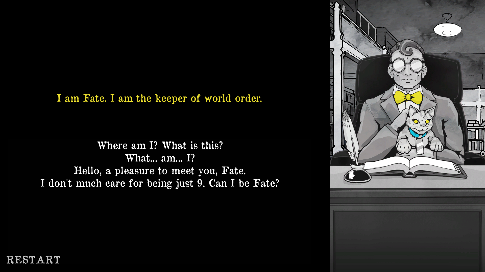
So..Because I am not a programmer myself, I needed some programmers. I had to get some other people interested and joining the project too. I knew that visuals help explain the feel and idea of the game and 2D art is one of the things that I CAN do well. So I made the first picture of the Grim Reaper behind his desk.
2. FIRST PROTOTYPE (Pre-production)
After making the design document and on-boarding some programmers to make a prototype, I saw the scope of this game and figured out I didn’t have time for doing all the art alone. I also had to deal with everything else on the game - the design, marketing and team leading. All of this while still studying full time and working a bit for money on the side.
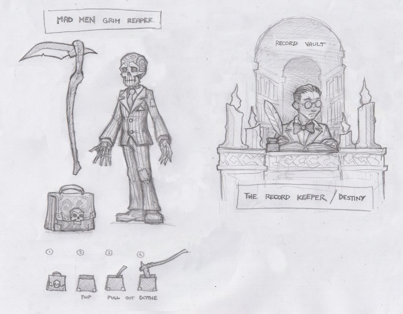
So I contacted an artist I worked together with on Tribocalypse VR, Raido. He works best with traditional methods and I am a big fan of his stuff. He joined the team and made a lot of awesome concept art for the game. (We still work together as a 2 member artist team on this game)
3. WORKING ON THE STYLE
Art Deco? I was thinking of an Art Deco style for the game and liked the idea of an old office/hotel building being the workplace that has both modern and really old elements in it. I really like games that use old stylistics like Fallout or Bioshock. (Nowadays it is hard to make a 3D Art Deco style game without someone saying: “Hey it looks so much like Bioshock!” but this is a 2D game)
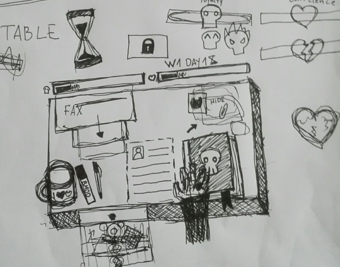
Pixel art? I really like working in pixel art but I felt that his game should not look too similar to a game it is heavily inspired by: Papers, Please! Also, Raido made such a clean looking pencil drawings that we decided to vectorize those (more about it in THIS blog post). Stick to the things that you are best at! I did find a great pixel art character creator that helped us to make different profiles fast (we needed a lot of them). It kind of makes sense too, because they are “printed pictures” in the game and we could have them in a non-pixelated world.
Colors? I love colors! I think they are underestimated and every game should have a palette before they start on working on the final assets. At first I thought, we should go with a velvety old-timey style but something was kind of missing. So I added a yellow color to contrast this. But it still didn't feel unique and gave off a regular fantasy vibe that doesn't fit the dull office work theme.
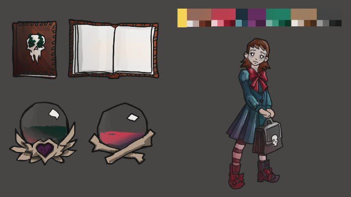
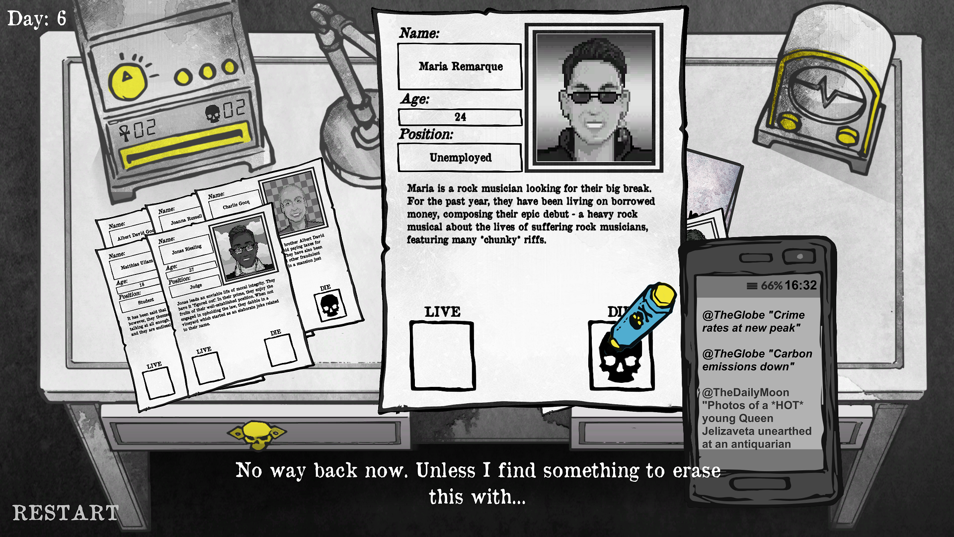
...I started thinking... Why do we have to go into dark colours when we talk about death? Should have something more eye catching and contrasting to the topic. Because we had a comic in the game, I thought, what about stylized gray-scale, with only 1 hue of color. This would make it pop really well. I was torn between having red (too Sin City and overused), blue (too sad/melancholic) and yellow (too happy/bumblebee). I decided to take them all and work out 3 hues that go together well.
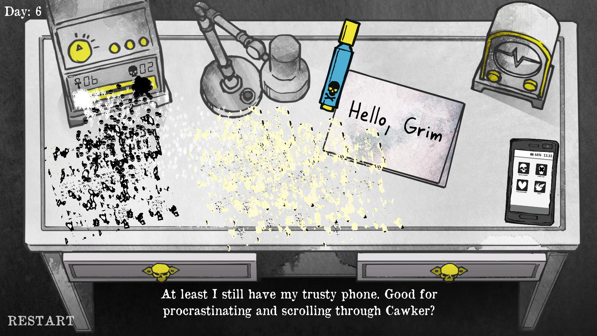
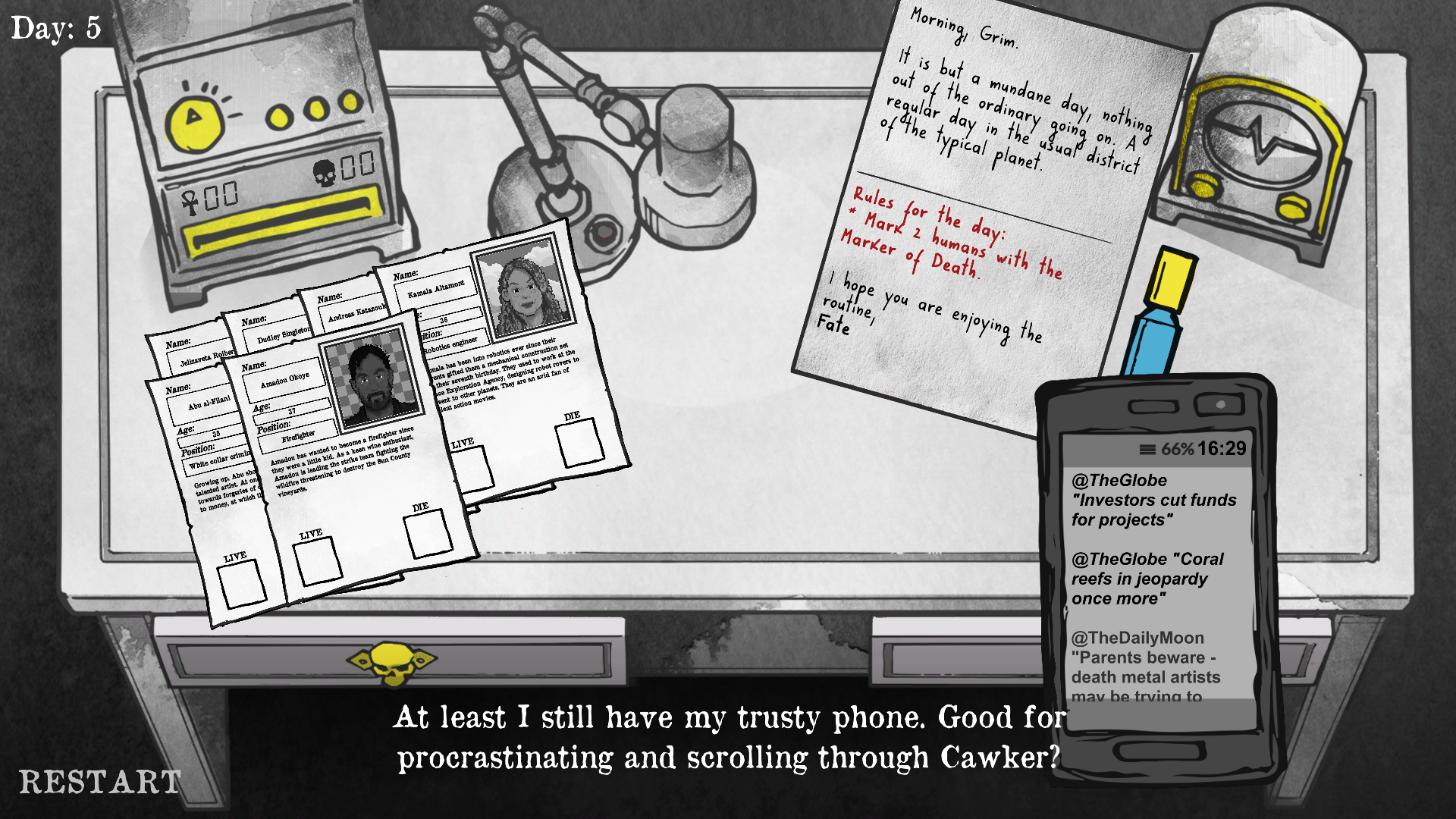
When we digitalized the drawings. They felt a bit too clean and lost the magic of the pen drawings they once were so I decided to mix it up in photoshop with some scans of watercolor.
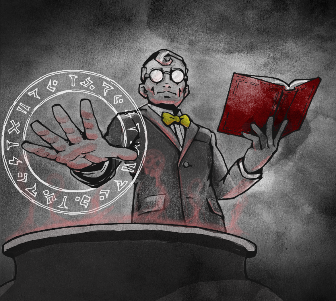
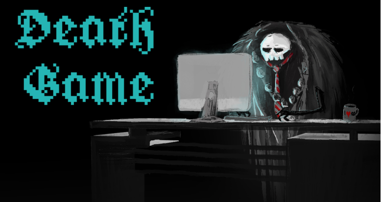
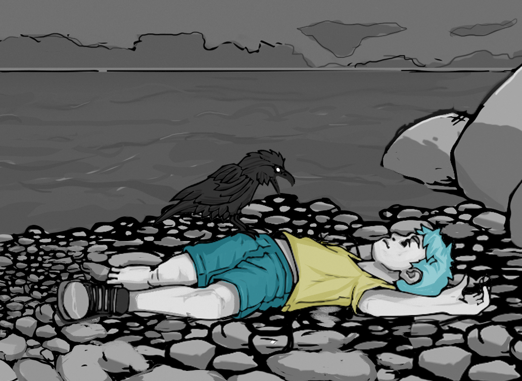
And this is how we got to the recognizable style that the game is today.
(there is more to it but I don’t want to make it too long, you can ask me about it in Twitter)
4. PRODUCTION
I ended my studies at an Art University a few months ago to become a full time indie developer. I also met Oak who became my partner in life and the project as well.^^ Being a full time indie and also having someone to share my responsibilities and help me manage this project with me has helped a lot. We also moved from Estonia to Spelkollektivet in Sweden and I have had much more time to digitalize all of the great art Raido has done and improve on the quality of the assets.

Thank you so much for reading! ^^
Ooh also, we have updated the demo and have a demo up on Steam too!
Take care! ♥
-Leene
Leave a comment
Log in with itch.io to leave a comment.