Death and Taxes
DevLog 5: Art
Good tidings, reader!
Oak here, again. As we've teased in previous weeks, we are keen to share the way we handle our art pipeline. It can be a super-long process to move from initial sketch to finished, in-game asset. We know this all too well, which is why we have given some serious thought on the matter to optimize our workflows. We are making a 2D game in a hand-drawn style, so literally the style itself implies heavy work and, well, drawing everything by hand over and over again. But this is not the only way.
Simply put: we cut art iteration times by using our concepts as a base for all further asset production. This can only really apply to 2D games and if you have a concept process in the first place. Also, it may sound extremely obvious to some, but this is a technique that does not necessarily get used all too often.
Here's how it works. We have our concept artist, Raido, come up with sketches for a specific asset, like this one, for example:
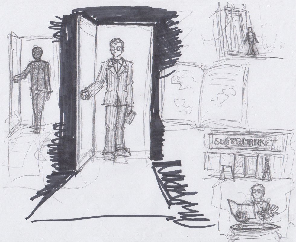
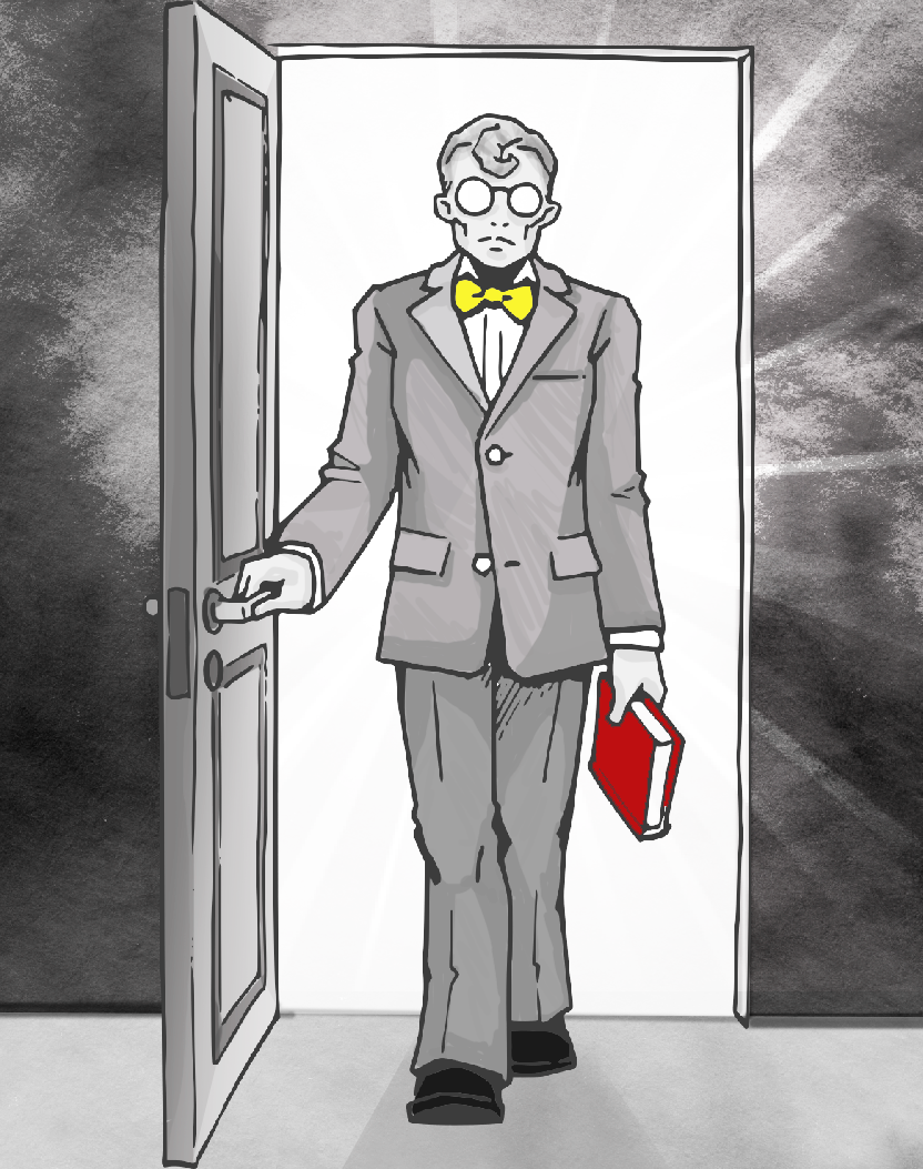
This is a storyboard sketch for the intro of the game. There is a fairly detailed sketch dead-center here. Fate is coming into a room, with a book in their hand, looking straight on. They are still holding on to the door handle with their right hand. This is a good candidate to add more detail to it. Next, the sketch gets isolated and then clean lineart is drawn with this as a base. And in some cases, it's literally drawing the lineart on top of the sketch on another layer. This piece is then vectorized to ensure good scalability for the assets. To do that, we use Adobe Illustrator's neat Vectorize function. It literally just takes seconds, saving us a lot of time.
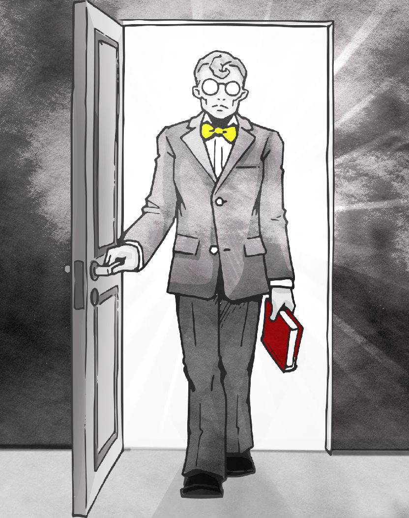
After converting to lineart, we have this:
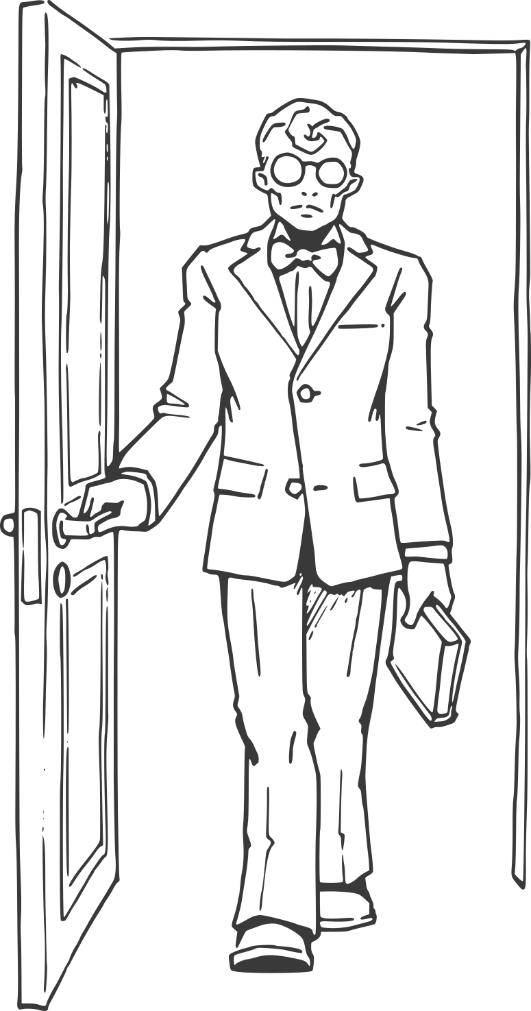
This is going to serve as the base contour for the final art. What happens next is adding a layer of paint on top. To cut down on art asset production time even more, we have a very limited palette. We only paint very few things in a colour other than grey, and, well, you can guess which the rest of the colours are if you look at our logo.
Yup. That's it. Just 3 additional colours. Our logo summarizes our palette in a neat fashion. Greyscale complemented by blue, yellow, red. There is an additional depth to the reasoning behind the selection of these colours, but that's for another devlog ;) For now, lets just stick with "they look cool". Which, by the way, they do. If y'all don't mind me saying.
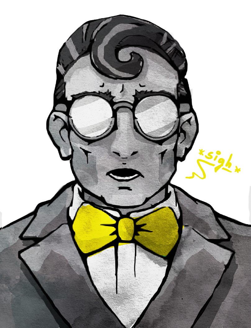
So we have lineart and a limited palette. What comes next? Well, our project lead and artist Leene going ham in Photoshop, basically. You can use any other painting software you feel comfortable with for this, too. An opaque brush is used to colour everything (inside the lines, of course). Highlighted details get special treatment by getting a splash of red, blue or yellow.
You have 2 guesses on which elements are the highlights here. Having a limited palette gives you a great edge if you want to put emphasis on something, because it will immediately pop out. Since our cutscenes, including the intro, are going to be in an interactive comic form, easy visual distinction is a must-have for us. If you want to see an example of it, check out our demo. The intro comic there is the first thing you see after clicking Play. Do note that that particular comic will be replaced by something more coherent! You're seeing one of the replacement panels now, actually :)
Okay, good, so we have basic highlights, colours in place, with some filter work in addition. To really give it a proper look, we usually do a couple of polish passes. This usually includes some shading work, checking if the saturation balance across the image is good and adding or adjusting filters. Another tip, especially if you're working with a wider palette: turn your work-in-progress image to greyscale to see how your saturation balance is. If your entire image becomes nearly entirely white or black then you are probably looking at a huge readability issue. If your aim is to communicate what is going on clearly, make sure that you're popping out the places you want to emphasize!
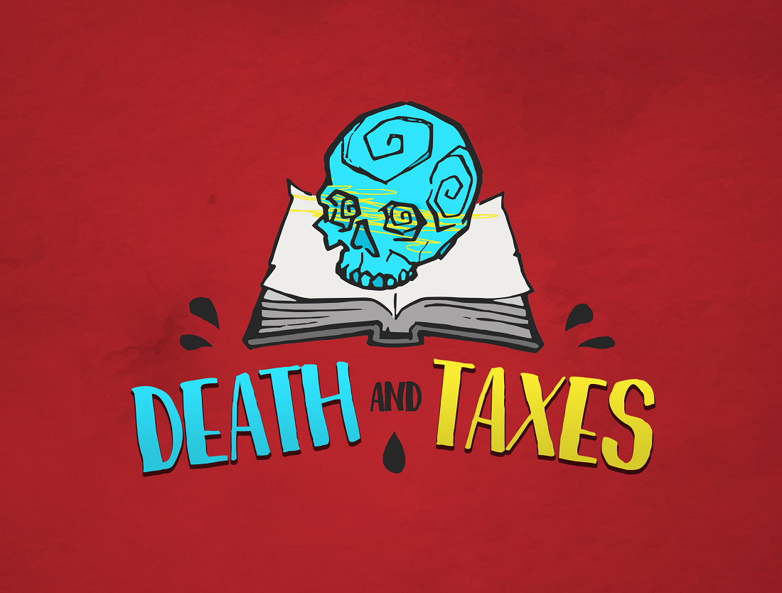
So all of that is done.. aaaand we have a final version!
That's it! In the final, comic-form, we will also split the parts of the comic panel to have a parallax effect. So it will look all fancy when you scroll past it, heh. After this is done, we import the asset into Unity, by, well, dragging and dropping it from Windows Explorer into our Assets folder, and slapping it into our comic panel layout. Default import settings, since we don't need to do anything specific with it. Also, no picture of the comic panel layout because that would be spoiling stuff ;)
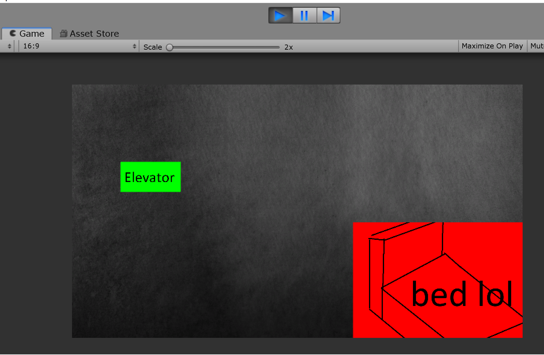
Here's a work-in-progress picture of the Grim Reaper's bedroom gloriously rendered in-engine instead:
Right. Anyway...
Since we're a small studio with practically no budget, we have to cut corners and work smart. We need to be efficient with our asset production and concise with the assets that we want to produce. With all the sketching and pre-work done, making one panel, as seen above, takes about a full day's work. So a comic that has 10 panels is 10 days of work, in addition to all the sketching, and additional lineart. So we are looking at quite a lot of time spent, even with the optimizations in our workflow. But I kid you not: if we wouldn't have such a workflow, we would be looking at triple the time spent or easily more. Again, these techniques might be familiar for some, but if you're in a tight spot and you're looking to downsize the time you have to put into asset production: find ways to optimize. Design a workflow (IMPORTANT), stylize, reduce palette, et cetera. Everything counts.
So just to repeat our process:
- Draw pencil concept, scan it
- Trace lineart on it in a digital art program (it's literally one button press in Adobe Illustrator: Vectorize)
- Apply colour and shading with limited palette
- Apply special effects and filters
- (Write post about it on itch.io in the hopes that it actually saves people time in the future)
TL;DR: a bunch of art nerds decided to make 2D art assets straight up tracing from pencil concept and slapping on some paint and a watercolor filter in Photoshop ¯\_(ツ)_/¯
If anyone wants to know something more specific on how we produce our assets, feel free to contact us!
Our Twitter: https://twitter.com/DeathNTaxesGame
Leene's Twitter: https://twitter.com/LeeneOfficial/
My Twitter: https://twitter.com/Oakenwarrior
Or just post on our community boards here on itch!
I hope you enjoyed the insight into the way we make our assets happen. Tried to keep it short enough so it's still readable for you guys, while still going into enough detail that there are some takeaways to be had. Phew.
See you again next week.
Much love,
Death and Taxes
Leave a comment
Log in with itch.io to leave a comment.